Icons have become indispensable today and are therefore a widespread and popular way to enhance a website. But icons are not only to be found on the internet - you can also find them in everyday life, for example at ticket machines or ATMs.
Why use icons?
Icons are small symbols that convey a message and are understandable in any language and culture. Ideally, they should be understood without additional text.
The main goal is for users to recognize and process content efficiently. When users look at the content on the screen, they recognize the icon faster than the surrounding text.Icons must support text and not replace it. They break up textual content and therefore have the same psychological purpose as a line break - the eye automatically wanders to the icon.
Advantages of icons
- can be quickly understood with a quick glance
- are understood internationally
- are visually appealing and can improve designs
- break up text deserts
- are space-saving
What types are there?
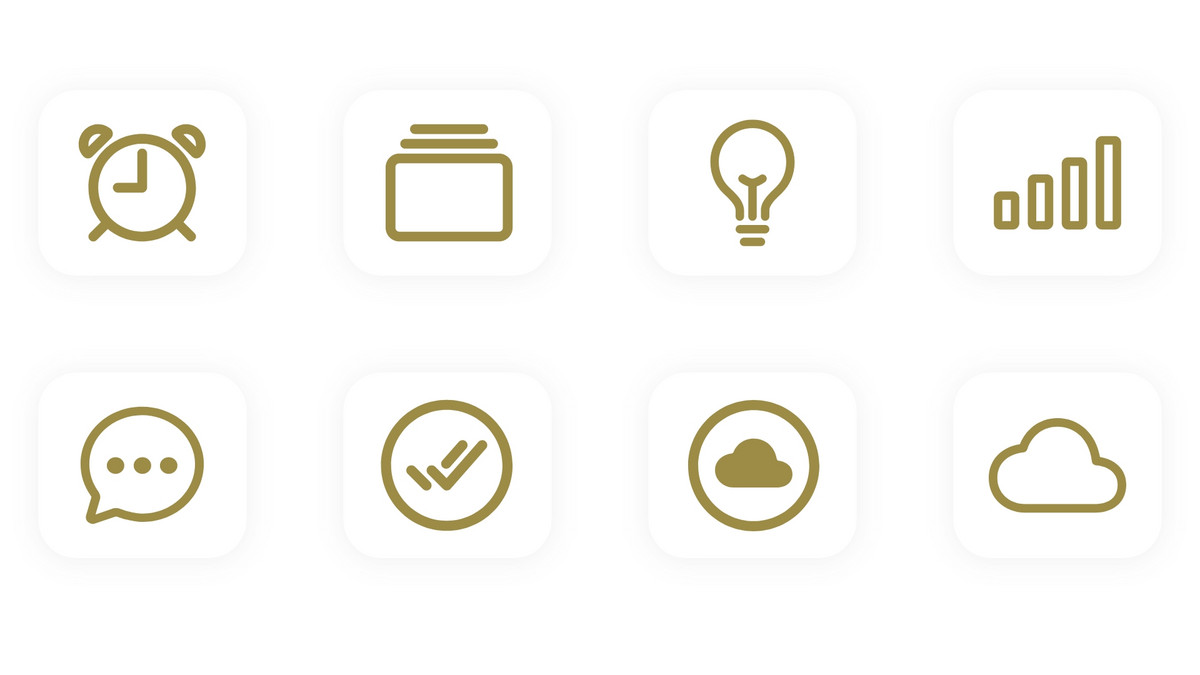
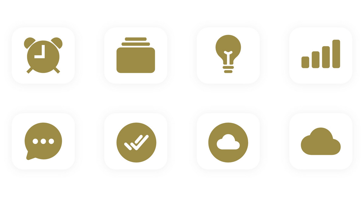
A few years ago, they were still very detailed and realistically designed, sometimes even brightly colored. Nowadays, they are usually flat and more minimalist in design. Two types have now become established: outline and filled icons.
Outline icons consist of contours. This type is characterized by a higher level of detail than Filled Icons. They take up less space and therefore appear more delicate.
However, there are unfortunately also scaling problems with outline icons. Scaled icons have a thicker line width, which leads to an aesthetic break.When using outline icons, you should therefore make sure that each icon has the same line width when scaled in order to achieve a uniform and harmonious overall appearance.
Filled icons are single-colored icons that are created by a surface. These icons take up more space than an outline icon and often have less detail.
Filled icons are well suited for online applications that require few but striking icons. The advantage of this type is that they are not subject to a ratio factor. This means that they can be scaled to any size without causing a visual break. In most cases, it is therefore sufficient to define the size in advance.Outline or Filled?
There have been studies on which style is captured faster by users. Unfortunately, there was no clear winner.
In summary, however, it can be said that a well-designed icon that clearly represents the underlying function with its shape is recognized more quickly than icons that do not. It doesn't matter what style the icon has.How do I select icons?
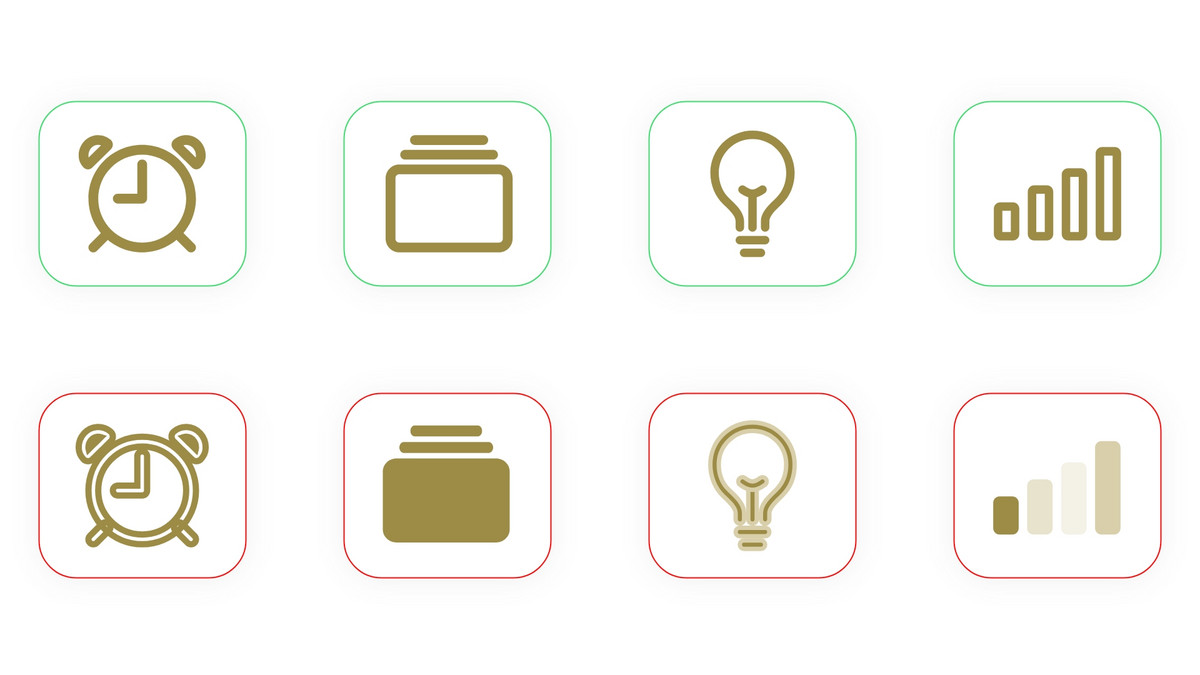
You should be consistent in your selection or design and not switch back and forth between Outline and Filled. This makes it difficult for users to grasp the content.
This applies to both types: If possible, choose an icon that represents the actual function and does not just refer to it symbolically. For example, the image with the calculator icon on the left is understood more quickly than the one on the right.Stell dir bei jedem Icon ein paar einfache Fragen:
- Wofür genau steht dieses Symbol – könnte man etwas anderes hineinlesen?
- Ist das Icon in der geplanten Größe eindeutig erkennbar?
- Wird ein ähnliches Icon in anderen bekannten Anwendungen für dieselbe Funktion genutzt?
Wenn du hier ins Stocken gerätst, ist das ein Hinweis: Das Icon ist inhaltlich nicht klar genug.
Do without details
Icons with graphic details should be reduced. Ideally, keep them as simple as possible. In this case, quick recognizability is more effective than a detailed, true-to-life image.
Nonetheless, the icons should fit into the overall picture and have a uniform design. Avoid 3D effects, 3D perspectives and drop shadows. The more effects there are, the more time and effort users need to interpret them.Uniform design
As already mentioned, you should avoid mixing styles. Do not switch back and forth between Outline and Filled Icons.
Symbolism of the actions
Make sure that you use an object that users know and can associate with a corresponding action. Example: When sending a message, this can be symbolized with a paper plane. The sheet of paper stands for the written message and the shape of the airplane represents the action of sending.
5. Barrierefreiheit
Icons spielen auch bei der digitalen Barrierefreiheit eine Rolle. Achte hier auf ein paar Grundregeln:
- Kontrast: Das Icon sollte sich gut vom Hintergrund abheben – gerade bei wichtigen Funktionen wie Navigation, Formular-Elementen oder Call-to-Actions.
- Größe und Klickfläche: Stelle sicher, dass Icons gut erkennbar und ausreichend groß anklickbar sind – insbesondere auf mobilen Geräten.
- Nicht nur Farbe: Nutze nicht nur Farbe, um Zustände zu unterscheiden (z. B. Fehler vs. Erfolg), sondern kombiniere sie mit Form oder Symbolik.
- Screenreader & Code: In der technischen Umsetzung sollten Icons sinnvoll im Code verankert werden – etwa mit sprechenden ARIA-Labels oder als dekoratives Element, das von Screenreadern ignoriert wird, wenn es inhaltlich nichts beiträgt.
So stellst du sicher, dass Icons auch für Menschen mit unterschiedlichen Einschränkungen bedienbar bleiben.
Conclusion
Icons are a simple but effective means of making a website intuitive and memorable. By and large, they should be self-explanatory and complementary. Consider these four important factors in particular: size, color, placement and consistency.


