When it comes to designing a digital product, buttons are indispensable. Buttons allow users to perform actions and make decisions. As simple as they may look, there are certain rules that should be followed in order to design a button concept that makes sense.
Button variants and their hierarchy - not everyone is the same
For a good user experience, websites or apps should ideally have more than one button variant. Based on the different button variants, the user can differentiate between what is important and what is not. A distinction can also be made between the following buttons:
CALL-TO-ACTION
A CTA button has the highest priority and should be displayed accordingly. In most cases, this button prompts the user to "log in", "buy now" or "register". CTA buttons are basically used where as many clicks as possible are to be generated.
PRIMARY BUTTON
Buttons with a high priority can be designed in the same way as call-to-action buttons, but also less conspicuously. However, they should be more eye-catching than a secondary or tertiary button. Primary buttons are an important element because they help the user to carry out processes such as "Next step", "Save" and "Start".
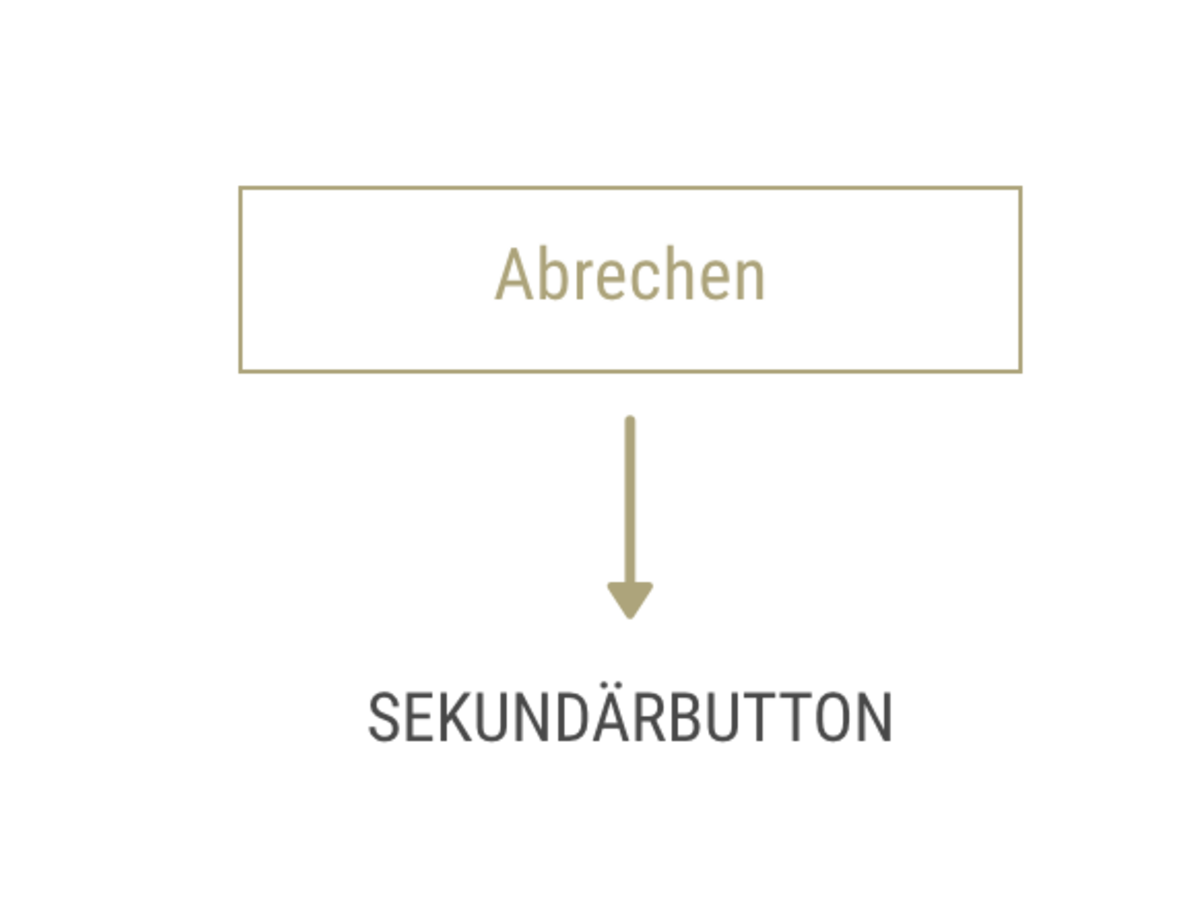
SECONDARY BUTTON
Secondary buttons are less conspicuous in terms of size, color and shape. They usually have an alternative function, such as "Cancel" or "Back". Secondary buttons are often placed next to primary buttons and thus form the alternative function.
TERTIARY BUTTON
Tertiary buttons are usually smaller, but they often appear in conjunction with icons that emphasize the function. These buttons can be used to "edit", "delete" or "add" things,
for example.Button size - how big can it be?
A button should be large enough to be conspicuous and at the same time easy to hit with the mouse cursor or finger. Fitts' law must be observed here. It states that the further away and the smaller the elements are, the harder they are to hit. And the more important buttons are, the larger and more conspicuous they should be. These correlations are very simple and easy to understand - and yet they are ignored in many applications.
The guidelines of desktop operating system manufacturers stipulate a height of between 21 and 23 pixels for buttons - as a minimum size. Significantly larger buttons are required for touch controls. The facts are actually clear: studies show that the average human index finger is 16 to 22 millimetres wide - sometimes significantly wider. The fingertip we use to operate touchscreens is between 8 and 10 millimetres wide.
Placement - where the user expects it
Buttons should ideally be placed where the user can find them most easily or where they expect to find them. The user should not have to search for buttons. Buttons should only be used for really important actions. Too many buttons should be avoided. As soon as the user has too many options, they will find it difficult to make a decision. In the worst case scenario, they will not make a decision at all. Ideally, content and buttons should be placed in a sequence that could also take place in a personal conversation.
States - not all buttons are the same
A button can have the following states:
- Default: This status indicates whether the button is active or inactive. This means whether it can be clicked or not.
- Focus: The button has been highlighted using the keyboard.
- Hover: If the user moves the mouse over the button, its color changes, for example. This indicates that the button is clickable. Pressed/Active: A status that is displayed when the user clicks and holds (pressed) or has clicked (active) the button.
- Progress/Load: This status is required if the action is not executed immediately but is in progress or requires a certain loading time.
- Disabled: This status shows the user that the button is inactive. This can be activated if, for example, certain requirements are met.
Label - what do buttons do?
A good button label tells the user what the click triggers. It is important to keep the text as short as possible. Buttons with long text lose their impact. Terms such as "Ok", "Yes" and "No" are often misleading and not meaningful. Therefore, verbs such as "Save" or "Edit" should ideally be used.
Conclusion
In summary, it can be said that the user should act intuitively without having to think about it for long. Buttons should be designed in such a way that the user immediately recognizes what is clickable and for what purpose.
Resolution of the A-B testing:
The correct answer is B. A common mistake that is made is to place the call-to-action button first, as this should be perceived first. However, this is not necessary in this case, as the button is already visually highlighted. Content and buttons should also be arranged in such a way that they reflect the course of a personal conversation.


