The 2021 federal election is just around the corner. The most important question is, of course, who will succeed Angela Merkel? The CDU politician has been in office since 2005 - back then, smartphones, websites and mobile internet were nowhere near as widespread as they are today.
What is the parties website check about?
The battle for votes is not only played out at events and on election posters, but of course also on the Internet. A meaningful website is therefore the be-all and end-all. We put the websites of the parties in the Bundestag through their paces and assessed them in the following areas:
- Navigation
- Conversion
- Target groups
- Design
- Joy of Use
- Content
The analysis, which was as objective as possible, was not about personal preferences in design, but about how the individual areas work for the party website and users. Each individual category was rated with points from 1-10, with 10 being the maximum. This made it possible to determine which websites work better than others from a user experience perspective.
Independent of the UX-side review of the websites, the pages were also evaluated on the topic of the federal election.Do the parties communicate their goals and plans clearly on the websites?
Are users picked up with the content? Is important information conveyed clearly and quickly?
All of these areas and questions were included in the evaluations of the individual pages. In the following, we briefly summarize the results of the party website check.
The CDU website
The overview
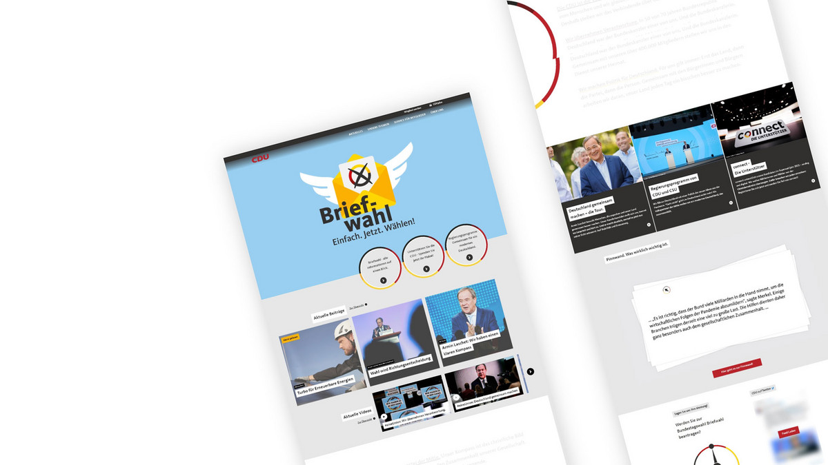

The menu itself is sensible and compact, but the visibility of the CDU election program is compromised. The menu navigation is also less user-friendly, as all subpages of the second menu level can only be accessed randomly. There are also minus points for the color choice of the menu, as it is sometimes difficult to read due to the color gradient.
There is no newsletter through which users can be informed about current CDU topics. There is a contact form for inquiries, but it is unnecessarily split into several steps and asks for a lot of data that is unnecessary in a standard contact request. This makes contacting us seem more complicated than it is.
To download further information, downloads are placed on the detail pages at the bottom of the page. In some cases, they are also only displayed as underlined text in the body text, which is not really recognizable.
The user guidance via the navigation of the CDU website is not ideal, as only the first menu level is shown. Most of the navigation takes place via the articles, although the individual pages could be better interlinked. As traditional CDU voters tend to be older, the website could be off-putting with the amount of content and moving images.
The design has a modern look and is also emotionally appealing thanks to the many images and videos. Due to the many moving elements, the first impression is somewhat overwhelming. Overall, the design makes a good impression and the homepage invites you to go into detail. However, it quickly becomes boring on the detailed pages, as users are repeatedly directed to the same pages and the individual content pages only differ in terms of text.
Overall, the visual language of the CDU website is consistent, fits the brand and is in line with the text. However, the portraits of people appear very stiff and fake.
There are interactive elements on the website, such as a pinboard and some map elements. This makes the website more exciting. More explanatory videos in the content would be good.
The many animated elements make the CDU website livelier, but some of them are not optimally placed so that they distract from the content. There are hover effects and microinteractions, but not for all elements.
All content loads quickly, which ensures a smooth user experience. Unfortunately, only the logo on the homepage really makes it clear that this is the CDU website. The content is up-to-date and meets the expectations of the site.
The SPD website
The overview
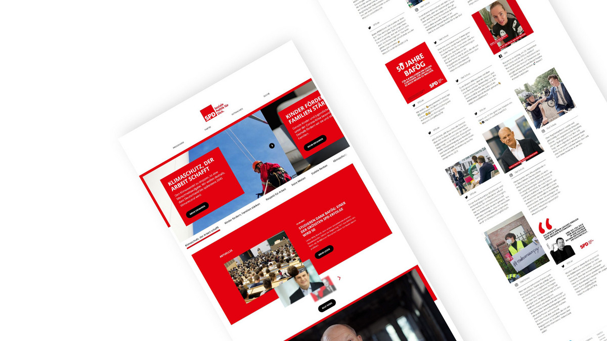
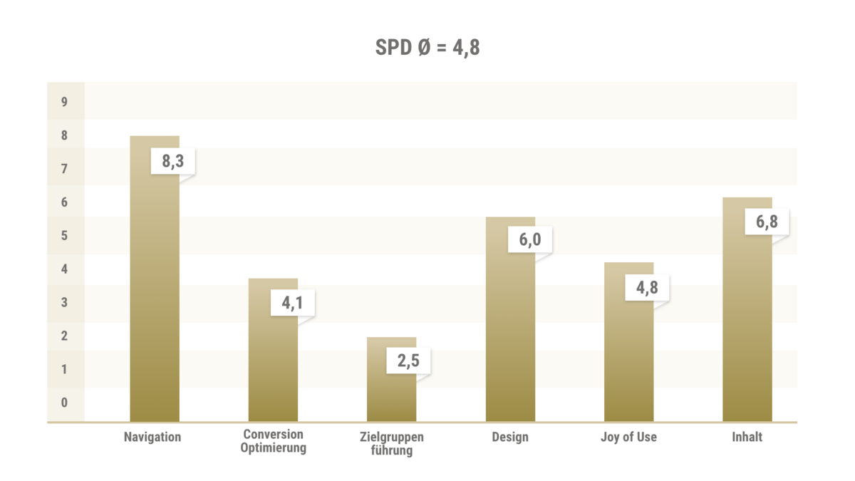
The menu on the SPD website is compact with just a few main menu items, providing a quick overview. The program is the supposedly most important item at the top. Unfortunately, there is no flyout for this menu either. Accordingly, more detailed topics cannot be identified via the menu, but only via the distribution list pages. Users have to find the individual topics independently via the individual detail pages. The design of the navigation is average. The navigation points are placed on a white background so that legibility is always guaranteed.
There is no proper SPD newsletter to keep you up to date, just a Telegram channel and social media channels.
There are various contact options and also a form. No SPD contact persons are listed, only the party executive in general. The contact form is somewhat confusing due to the many bold lines. The marking of the fields is very confusing, as traditionally the mandatory fields are marked. Here, however, it is the other way around and the optional fields are marked.
The user guidance is inadequate, as users can only click on detailed pages. A flyout or at least an overview of the detail pages would be useful.
The typical user scenarios are covered by the party program, becoming a member, press contact, etc.
The target group is hardly reflected in the website. The design is very striking, but extremely text-heavy. This is unlikely to really appeal to any SPD target group.
The SPD website is very striking and visually appealing, but the red is too extreme. There are a lot of pictures, most of which portray Olaf Scholz. The election program is always prominently highlighted. The red could be used more creatively to avoid the masses.
The first impression of the SPD website is basically not bad, but slightly overwhelming. There are an extremely large number of red areas, lots of buttons, with images and text in between.
There are a few black and white images that are mixed in with many stock images. This makes the imagery look inconsistent. In addition, some texts are unfortunately much too long
There is some scrolling interaction on the page, which makes it more exciting to use overall. Important content is teased by pop-ups, but these are rather annoying after repeated visits to the page. There are no other interactive elements or microinteractions.
The logo in image and text form makes it immediately clear that it is about politics. Otherwise, there is no general introduction to the SPD, but a direct introduction to the topic. The overview pages are balanced with text and images. The detailed pages, however, are characterized by text deserts. It appears that print documents have been transferred 1:1 to the web. The content of the site is up-to-date.
The GREEN website
The overview
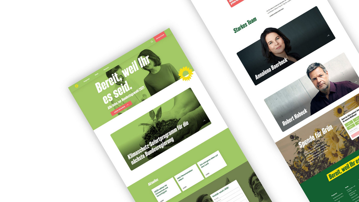

The menu is reduced to just a few menu items. The program is well positioned as the first menu item. The "Become active" item is a kind of CTA, as it is separated and highlighted. This item is always in the foreground and stands out thanks to the color scheme.
There is no slider on the homepage, but a header area with a large image and CTA for information on the federal election, so that users are taken directly to the most important topic here.A direct link to the newsletter registration is located in the footer. There are two registration forms on the home page of the Green website - one for the election campaign and one for a donation. No benefits are communicated for the newsletter, only that general updates are to be expected. Accordingly, no individual content can be played out.
The form itself is user-friendly, but very long due to the data protection text. Unfortunately, there is no contact form, only general contacts with e-mail address, telephone number, address and fax. All the individuals shown are presented with full contact details and social media links.
User guidance is mainly provided via the detail pages. Some of these are very long, which means that the further teasers are very far down the page. There is no anchor navigation on the page to jump directly to specific topics. Further teasers are not always offered on the detail pages, meaning that users end up in dead ends.
The Greens' target group, which tends to be younger, can be found to some extent. Although the topic areas are well presented, there should be significantly less text clutter so that the content can be skimmed through more quickly (images, icons, keywords would be good).
The overview pages are well designed, the detail pages need to be optimized. The Greens' CD has been interpreted in a modern way for the website, which looks very coherent overall. The first impression of the site is good overall, only the green above the images doesn't look healthy.
The visual language is for the most part consistent and coherent with a good mix of illustrations and photographs. This mix makes the site look much younger. The font sizes are well chosen, only some headlines are too large.There are no interactive elements. At least a map module to view the local Green Party groups would be nice. There are no microinteractions, but at least there is almost always a hover effect
At first glance at the page, you can guess which party it is from the color. There is no real "clarification about which topic, which party it is about.
In general, there are too many very long texts, which is not easy to read. At least these texts are divided by headlines and paragraphs. There is some up-to-date content such as news and press articles.
The FDP website
The overview
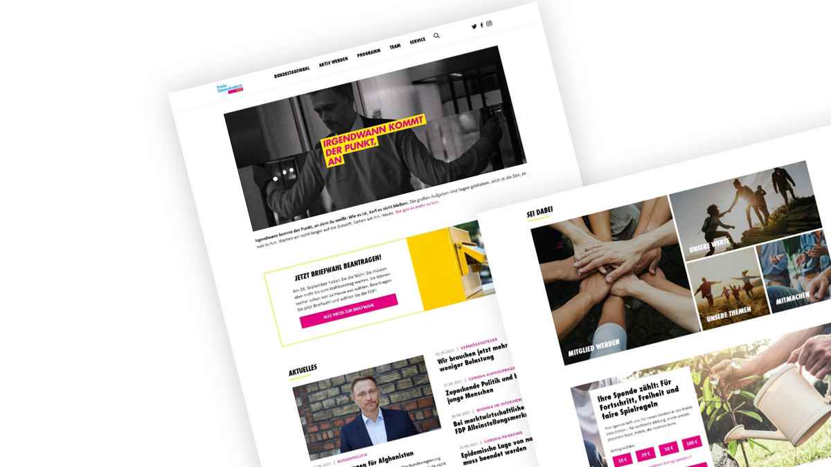

The menu has more main menu items in comparison, but is still very clear. The main menu items cannot be clicked, only the subpages in the flyout. The flyout works well and the number of subpages is neither too many nor too few.
The menu bar of the FDP website is placed in a familiar position at the top, is also sticky and has a white background so that it is always legible. There is no breadcrumb for orientation on the detail pages.The newsletter registration is placed via a link in the footer. In addition, there is a generously placed form on some pages. The form is reduced with only one mandatory entry, the e-mail address. Why the cell phone number is requested is questionable. Data protection is not ticked here, but is automatically assumed.
There is no contact form, only general contact information with e-mail address and postal address, as well as the individual addresses of the regional associations. Some FDP contacts are listed under press contact with all the necessary contact information.
Users are redirected to the detail pages via teasers, regardless of the navigation. The selection is sometimes too large, but sometimes there is no redirection at all and thus a dead end. The typical user scenarios are covered, but there is no exchange or interaction with users.
The FDP website is visually appealing overall, although the detailed pages are very text-heavy. The CD was taken into account for the website and interpreted in a modern way. Overall, the elements appear coherent and the first impression invites you to click further.
The visual language is not uniform. There are black and white images that appear very dramatic and colorful images that appear more harmonious. Overall, this seems less appropriate.The font sizes are well chosen, but sometimes there is too much text and in other places there is too little content, or the content is hidden in accordions.
There are no interactive elements, except for tabs and accordion. There are no microinteractions and there are no hover effects everywhere. As a result, clickable elements are not necessarily recognizable.
The logo is present on the FDP homepage in the navigation bar. Otherwise, there are no references to the party, the topic or the focal points. The texts are too long overall. The core topics are highlighted visually, but compete visually with the general topics, so users may not be able to access the demands/core topics directly.
There is current content such as news from the FDP, but this is rather hidden as it cannot be found via the menu.The LINKE website
The overview
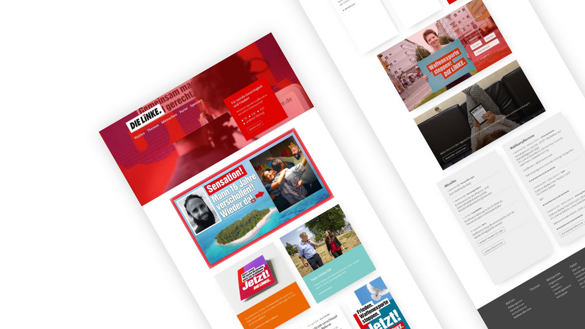
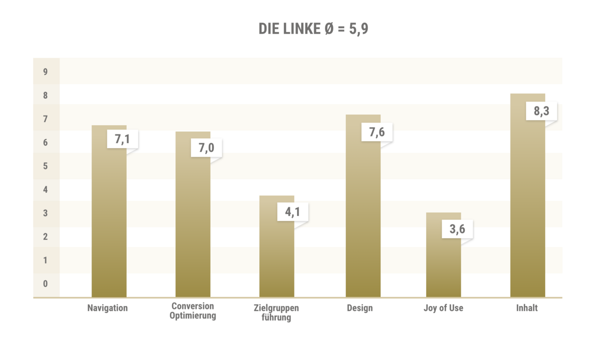
The menu itself is sensible and compact. The Elections menu item is at the top and contains the election program as a sub-item, which makes a lot of sense in this election year. The flyout is hidden behind a hamburger menu that appears at the top right when scrolling down. There is also a sitemap in the footer, which provides a good overview of the website. However, the hierarchy of the pages could be better visualized here. Due to the same font size, the Linke website is not scannable.
There is a newsletter that users can use to find out about current topics and the Left in general. The newsletter is advertised with various teasers on the homepage and subsequent pages, communicating the benefits. Registration is very simple and streamlined. Unfortunately, the newsletter cannot be customized to the interests of the users.
There is a contact form for inquiries, as well as contact to the Linke's general press office. There are also several telephone hotlines in the footer, such as Citizens' Dialogue or Member Questions. The contact form is clearly laid out but could be reduced even further. Unfortunately, there are almost no staff photos, which could create more trust and closeness.The user guidance via the navigation and the Hamburg flyout is good. Further user guidance is provided via the articles, although the individual pages could be better linked. The party's demands are clearly communicated on numerous pages with eye-catching teasers such as "die Linke fordert". This clearly differentiates Die Linke from its competitors and helps users to make a decision. In this way, Die Linke manages to respond particularly well to the typical needs of voters.
The imagery shows numerous pictures of active members. This corresponds to the party's target group and conveys an authentic image and trust. The website is presented in a simple, modern and timeless style that appeals to both older and younger target groups alike.
The design looks modern, appealing and simple. Red predominates as an accent color, but is combined well with other colors from the corporate design. This makes the design look very varied. With its varied modules and user-oriented content preparation, the Linke site appeals to a broad target group from young to old. The appealing presentation increases the reading time on the detailed pages.
The visual language shows many active members. The images are harmonious, diverse and authentic. The user gets a positive impression of the members. The headlines and texts are all easy to read. The detail pages are well subdivided with subheadings and helpful teaser elements.
The joy of use of the website is reduced to the design, teasers and images. There are no interactive elements, animations or scroll effects. There could be more of these. Interactive maps would be helpful for the presentation of the election tour or the federal committee. Simple accordions or filters were used here instead.
All content loads quickly, which ensures smooth use. On the homepage, the logo, the top candidates and numerous campaign teasers make it clear which party is involved.
The detailed pages are very user-oriented. The Left Party's demands are clearly highlighted for each topic. The texts appear to have been specially prepared for the web. This primarily extends the reading time of users. The content is up-to-date and meets the expectations of the site.The AfD website
The overview
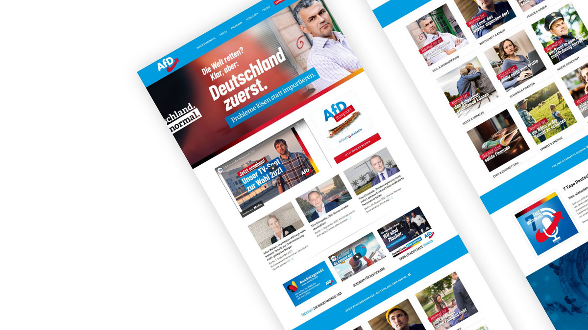
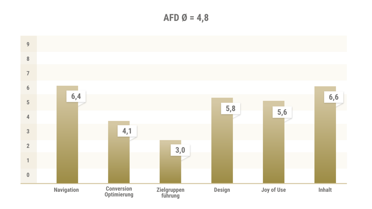
The menu is clearly laid out with six main menu items. The simple flyout gives users a good overview of the subpages on the second level. Further subpages can be accessed via the overview pages and teasers. Some terms in the navigation are very similar, and there are some duplications that could be avoided.
The main navigation is sticky on a blue background. The legibility and font size are well chosen. The hover effects encourage users to click. The AfD logo is placed very prominently at the top left. Although the header slider offers an initial insight into the focus topics, it appears confusing and cluttered. The amount of movement caused by the zoom effect and the change of slides make the page look cluttered.The AfD newsletter is not advertised prominently in the footer or in the teasers. Unfortunately, it can only be found by searching. The added value of signing up is not communicated. The registration form is kept very compact with the most necessary form fields. There is no marking of mandatory fields. Unfortunately, this only becomes clear when you enter an error.
There are various contact options, such as a compact contact form, a map of Germany with a direct link to the AfD state association websites, telephone numbers with office hours and general contact details. No contact persons are listed, only the party executive in general.
The user guidance is partially inadequate, as many subpages duplicate each other or are thematically similar. Content could be better summarized here and the focus could be placed on clear, unambiguous user guidance.
The entire content of the website has a clear focus on party objectives and often only serves the user-oriented scenarios by linking to PDFs, sometimes not at all. The target group is only reflected in the website to a limited extent. Although the imagery often corresponds to the party posters and conveys a uniform image, more pictures of AfD members could be shown. As a result, the impression remains professional, but somewhat unapproachable and staged.The AfD website is very striking and visually appealing. The content is sometimes quickly overwhelming due to the numerous headlines and texts on the images. The images, especially the poster motifs, are of high quality and evoke emotions. The choice of images is harmonious, but the similar depiction of individuals makes it look boring and staged in the long run. More authenticity would be useful here.
The text lengths are often rather short. There could be more explanatory text about the downloads in some places so as not to only show print content. Under Program there are often long paragraphs and text deserts, as the print content is shown unchanged as text.
There are a few scroll animations on the start page, but this is not particularly noticeable. There is an election countdown on the homepage that counts down automatically. The animation in the header teaser, as well as the change of individual slides, is rather overwhelming and hectic. Zoom hover effects on individual teasers are appealing but not consistent.
The logo in image and text form makes it immediately clear which party it is. The website is otherwise accessed via the topics and the AfD election program.
The homepage loads quickly. The loading times of the subpages are too long, especially due to the frequent download teasers, and should be optimized. The content presentation on the subpages is in need of optimization. The content is often presented as a PDF or download. A summary of the content would help users. The content on the AfD website is up-to-date.Summary
The fact is: None of the pages stands out positively, as all pages have positive and negative aspects. However, if you only look at the design, the SPD page is the least attractive, as the red is used too dominantly. Followed by the design of the AfD, which appears overloaded with similar elements and is rather boring on the subpages.
The FDP and Green Party pages are somewhat more minimalist in design, making them pleasantly simple without appearing boring. There is a lot of movement on the CDU page, which tends to distract from the actual content. From the user's point of view, there is no page that was difficult to use. What was noticeable was that the candidates for chancellor are very much in the foreground on all pages. Unfortunately, the election program is less in focus on some pages. The Left presents the demands and solutions to the election program best on the subpages.
This also shows that a special preparation of the content for online media offers a clear advantage in terms of dwell time.


